


Before talking about flexbox we will know a little about CSS because flexbox is a part of CSS. CSS stands for Cascading Style Sheets. It is used to style and layouts web pages, including colors and fonts. It defines how your web pages will look like. Now let's know what is Flexbox.
Flex Box
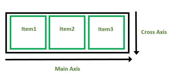
Flexbox is a layout model that provides an easy way and more flexibility to arrange items in rows and columns. With the help of the flexbox, you can easily give proper space between the items. Flexbox is single-dimensional. When we declare display: flex, There is two axis - One is the main axis and the other is a cross axis. by default, The main axis is horizontal and the cross axis is verticle.
Properties that can be applied to the flex-container -:
Display:
It defines that if you give value flex to display property, It turns the flex-container into a block-level flexbox. The other value is inline-flex. With this, a flex-container act like an inline level element.
Syntax :
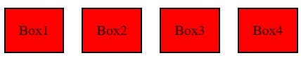
   <div class="flex-container">
       <div class="boxes">Box1</div>
       <div class="boxes">Box2</div>
       <div class="boxes">Box3</div>
       <div class="boxes">Box4</div>
    </div>

.flex-container {
  display: flex;
}

.boxes {
  margin: 30px 10px;
  background-color: red;
  padding: 15px;
  border: 2px solid black;
}
Output :
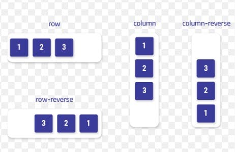
Flex-direction:
It defines in which direction the container wants to place the flex items in the form of horizontally or vertically. row, row-reverse, column, and column-reverse are the values of flex-direction. By default, the value of flex-direction is a row and you can set it according to yourself.
Example -
Justify-content:
It is used to align the flex items according to the main axis.
justify-content: flex-start; The items are pushed towards the start of the container's main axis.
justify-content: flex-end; The items are pushed towards the end of the container's main axis.
justify-content: center; It aligns the flex items at the center of the container:
justify-content: space-between; The remaining space is distributed between the items.
justify-content: space-around; The remaining space is distributed around the items: this adds space before the first item and after the last one.
Align-items:
It is used to align the flex items according to the cross axis.
- align-items: flex-start; It aligns the flex items at the top of the container:
- align-items: flex-end; It aligns the flex items at the bottom of the container.
- align-items: center; Flex items are centered in the cross-axis.
- align-items: stretch; This is by default, Flex items stretch to fill the full container.
- align-items: baseline; Flex items are aligned such as their baseline align.
Align-content:
The align-content property specifies the alignment between the lines inside a flexible container. It is used to flex the lines.
Possible values of this property - center, flex-start, flex-end, space-between, space-around, space-evenly, stretch, baseline
Flex-wrap:
The property flex-wrap defines whether the flex items are forced in a single line or can be flowed into multiple lines. By default, this is onto a single line but you can change it according to yourself.
- nowrap This is the default value. It defines that the flexible items will not wrap.
- wrap It defines that the flexible items will wrap if necessary means flex items will wrap to multiple lines.
- wrap-reverse It defines that the flexible items will wrap in the reverse form, It means the last item will come first.
Shorthand property flex:
flex-grow: It defines how much space a flex item should take if there is available space.
flex-shrink: It defines how much the item will shrink compared to other items inside that container.
flex-basis: It defines the initial length of a flexible item. flex-basis works if the element is flexible.