

Grid -
In CSS, Grid is a powerful tool that allows for two-dimensional layouts to be created on the web. The grid has powerful abilities to control the sizing and positioning of boxes and their contents. Before the grid, we used tables, then floats, positioning and inline-block but the grid has easier to design the web pages without floats and positioning. The CSS Grid Layout Module offers a grid-based layout system, with rows and columns.
Properties of Grid -
Display
You can make an HTML element a grid container when its display property is set to grid or inline-grid.
Syntax -
display: grid;
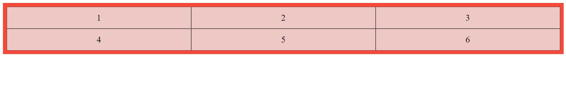
grid-template-columns
It defines the number and width of columns. You can set individually the width of each column, or set a uniform width for all columns using the function repeat().
Syntax -
grid-template-column: 200px auto 200px;
Or,
grid-template-column: repeat(4, 1fr);
Note: fr means fraction unit for measurement, all the boxes will be equal in size.
Example -
.container {
  display: grid;
  grid-template-columns: auto auto auto;
  padding: 10px;
  background-color: #f94737;
}
.item {
  border: 1px solid rgba(35, 35, 35, 0.8);
  background-color: rgba(234, 233, 233, 0.8);
  font-size: 24px;
  padding: 15px;
  text-align: center;
}
Output -
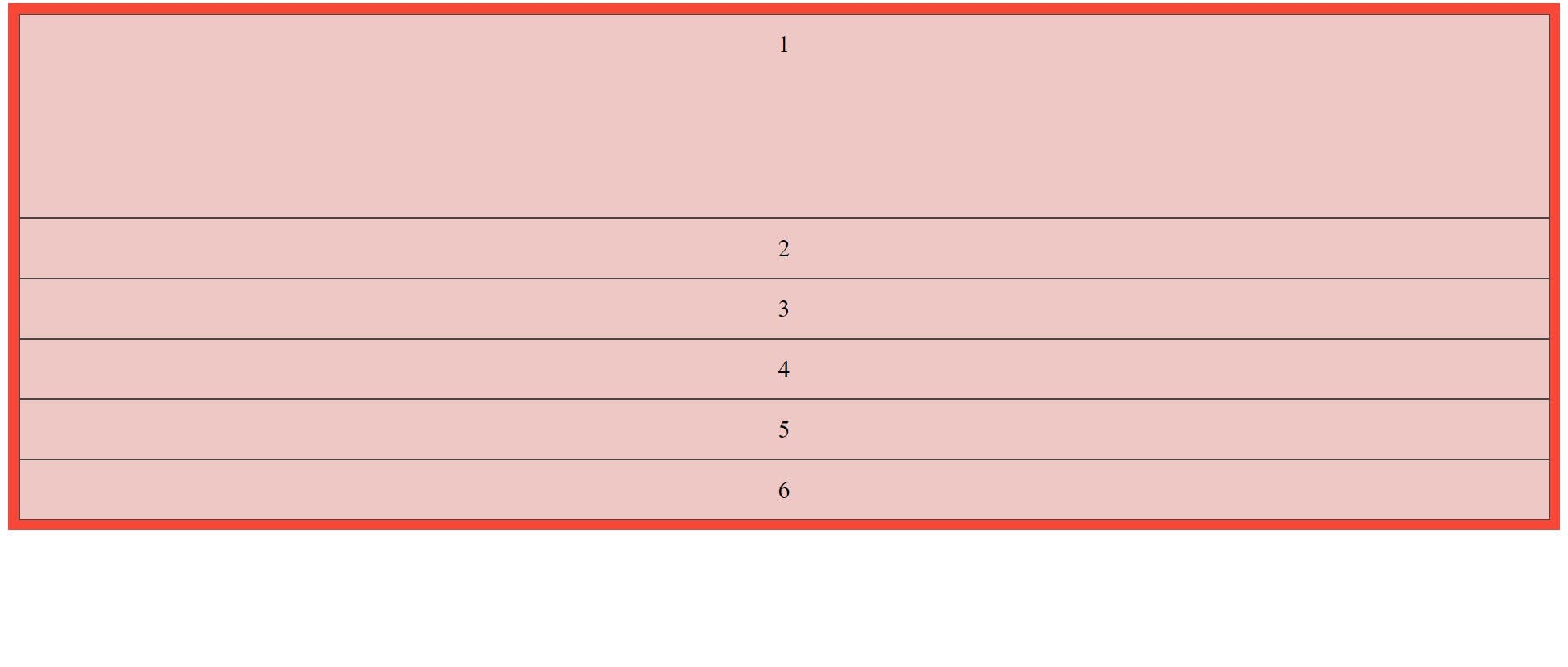
grid-template-rows
It defines the number and height of rows. You can set individually the height of each rows, or set a uniform height for all rows using the function repeat().
Syntax -
grid-template-row: 200px auto 200px;
Or,
grid-template-row: repeat(4, 1fr);
Example -
.container {
  display: grid;
  grid-template-rows: 200px auto auto;
  background-color: #f94737;
  padding: 10px;
}
.item {
  border: 1px solid rgba(35, 35, 35, 0.8);
  background-color: rgba(234, 233, 233, 0.8);
  font-size: 24px;
  padding: 15px;
  text-align: center;
}
Output -
grid-template-areas
It defines which grid cells each item will span. Each row is defined within quotes.
Syntax -
.grid-container {
    display: grid;
    grid-template-columns: repeat(4,1fr);
    grid-template-areas:
        "header header header header"
        "sidebar content content content"
        "sidebar footer footer footer";
}
Shorthand property of grid-template:
grid-template: 200px / auto auto auto;
It is a shorthand for grid-template-rows, grid-template-columns, and grid-template-areas.
Gap -
In the grid, you can set the gap in columns and rows.
properties of gap :
column-gap: With this property, you can give a gap between the columns. ``` column-gap: 30px;
**row-gap:** With this property, you can give a gap between the rows.
row-gap: 30px;
**gap**: This is the shorthand property of row-gap and column-gap.
gap: 30px 40px;
30px for rows and 40px for columns or you can give one value to both, here is the syntax-
gap: 50px;
## Justify-items :

With the help of this property, you can give a position to grid items (children) inside grid containers along the Main Axis. It has four values start, end,  center, and, stretch. Let's see -

- **start** –  items to be flush with the start edge of their cell
- **end** –   items to be flush with the end edge of their cell
- **center** – center align items of their cell
- **stretch** – covers the whole width of the cell (this is the default value)


## Align-items :

You can give a position to grid items (children) inside grid containers along the Cross Axis. It also has the same value as justify-items. Let's understand -

- **start** – With this, you can align items to be flush with the start edge of their cell
- **end** – With this, you can align items to be flush with the end edge of their cell
- **center** – center align items of their cell
- **stretch** – covers the whole height of the cell (this is the default value)

## Justify-content :
It is used to horizontally align the whole grid inside the container.

**Values of justify-content -**
start, end, center, space-evenly, space-between, space-around, and stretch.

## Align-content :
It is used to vertically align the whole grid inside the container.

**Values of align-content -**
start, end, center, space-evenly, space-between, space-around, and stretch.

# Properties for the children -
You can style the grid items according to yourself so that they will span multiple columns and/or rows.


## Grid-column
This is a shorthand property for the **grid-column-start** and **grid-column-end**. It defines where the item will start, and where the item will end on the column.

*Syntax-*
grid-column: 1 / 4; or you can set it like this also, grid-column-start: 1; grid-column-end: 4;
Note: It means your item will start with column 1 and ends before column 4.


## Grid-row
This is a shorthand property for the **grid-row-start** and **grid-row-end**. It defines where the item will start, and where the item will end on the row.

*Syntax-*
grid-row: 1 / 4; or you can set it like this also, grid-row-start: 1; grid-row-end: 4;
Note: It means your item will start with row-line 1 and ends on row-line 4.

## Grid-area
This is a shorthand property of grid-row-start, grid-column-start, grid-row-end, and the grid-column-end property.

Syntax:
grid-area: 1 / 4 / 6 / 8